Setup
Colors
The Emory theme is a three-color theme. The colors on this sample site are displayed below. The flow of colors throughout the design is set and cannot be changed.
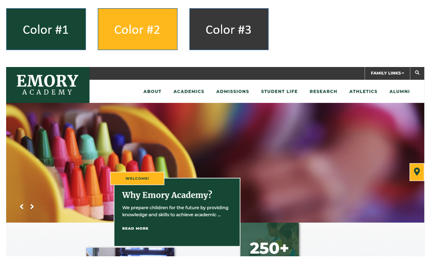
All colors must meet AA Compliance as follows:
Color #1: Must be AA Compliant when paired with white and color #2.
Color #2: Must be AA Compliant when paired with color #1
Color #3: Must be AA when paired with white. This color could be a repeat of Color #1.
Fonts
Fonts are set for each theme and cannot be changed. Each font is a Google Responsive font, which are free for all uses.
Some Headers/Paragraph Text - Montserrat
Get this font from Google Fonts
Some Headers - Merriweather
Get this font from Google Fonts
Logos
This theme features a white logo in the header and a full color logo in the footer.
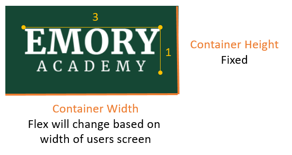
Header Logo
A horizontal arrangement of the logo and/or org name is recommended. A logo which has a 3:1 ratio (width:height) will display well.
If the logo is small or does not include the org name, the org name can be typeset by the School Site team at setup. We will use one of the standard fonts to typeset the text.
In the header, the container that holds the logo has a static height and a flex width based on the width of the screen.
Footer Logo
The footer logo is a full color logo. The header size ration (3:1) also applies to the footer logo.
Navigation
This theme allows for up to 7 top navigation categories. When users hover over each navigation category, a dropdown panel will reveal up to 2 text links (outlined in red in the image below) and the level one pages listed in two columns on the right side.

Quicklinks Dropdown
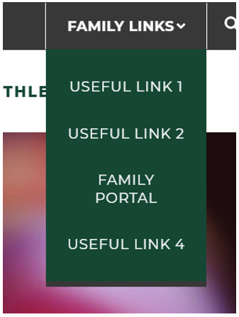
The Quicklinks Dropdown allows up to 4 links to internal pages or external websites.
The dropdown title ("Family Links") can be modified.
The Quicklinks dropdown can be inactivated to remove the dropdown on the site.
Search Bar

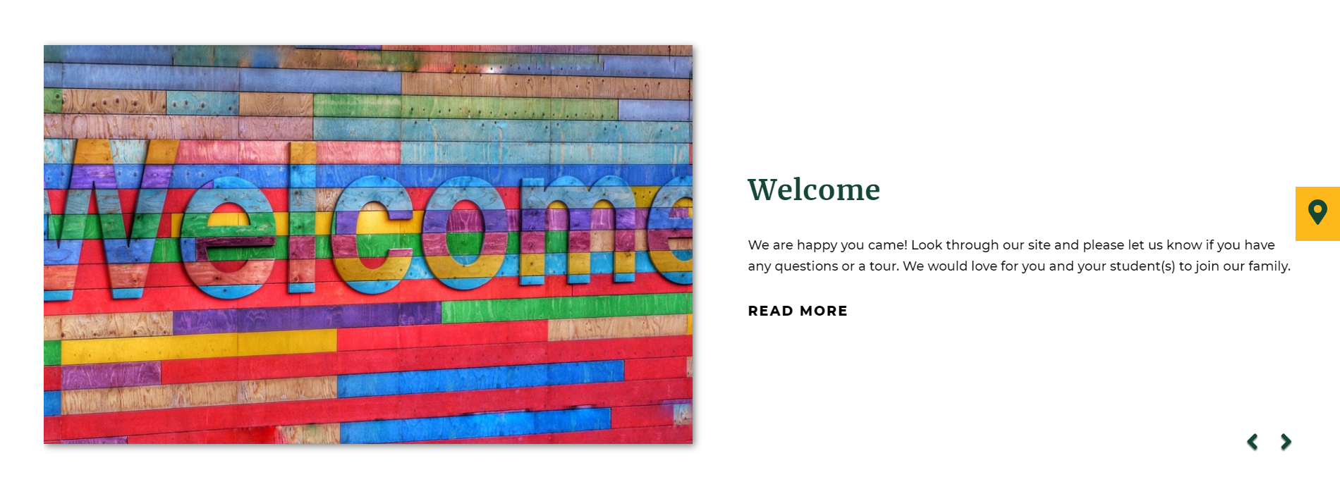
Hero Slideshow/Video
The Hero Slideshow features a key messaging container with a heading, subheading, caption text and "Read More" hyperlink. The heading ("Welcome" in the yellow container) is static and can be toggled on or off. The elements in the green container (subheading, caption text and hyperlink) can be unique for each slide show image. There must be at least a subheading or caption text entered for each slide show image as this container is always visible.
The images for the slideshow are editable through the CMS site manager.
The homepage slideshow can have up to 8 active slides at a time to ensure quick load time. We recommend keeping the number of active slides at 5 or less.
The slideshow can be replaced with a video anytime. When the video is activated, the key messaging container is hidden, displaying the video across the entire width of the page. Hero videos do not play audio.
Home Page Content Sections
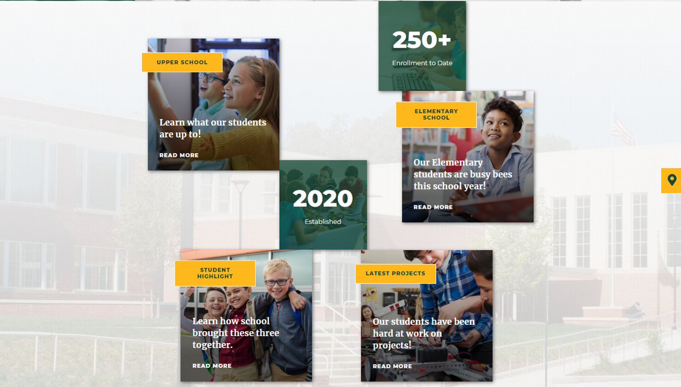
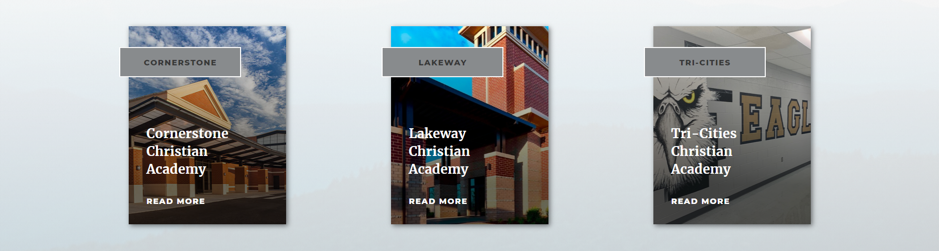
Section 1: Tiled Section
The first section of the home page includes a Tiled Section with up to 4 Callout Containers with editable image, heading, subheading and "Read More" button; 2 Stat Boxes with editable image, heading and caption text. In addition, the image in the background of this section is also client editable. The system adds a white transparent overlay over the image to give it a ghosted affect.
Section Tools
Callout Containers
-
Uses Slide Show Tool.
-
Images will be cropped to 399px x 400px
Statistic Containers
-
Uses New Home Page Custom Tool
-
Images will be cropped to 266px x 272px
Background Image
- Uses Content Editor
- Image will be cropped to 1400px x 915x
Section Variation
By inactivating the 2 stat boxes, the callout containers will align vertically in the content section. In addition, callout containers can be inactivated. In the example below, one callout container is inactive, displaying only 3 containers.
Section 2: Story Section
The story section of the home page will display up to 3 different stories, each with an image, heading, sub-heading, caption text, and a read more link if a hyperlink is setup. If more than one story has been added, controls will appear in the bottom right allowing users to access additional stories.
Tool Used: Custom Home Page Tool
Image Dimensions: 936px x 576px.
Section 3: Upcoming Events & Announcements
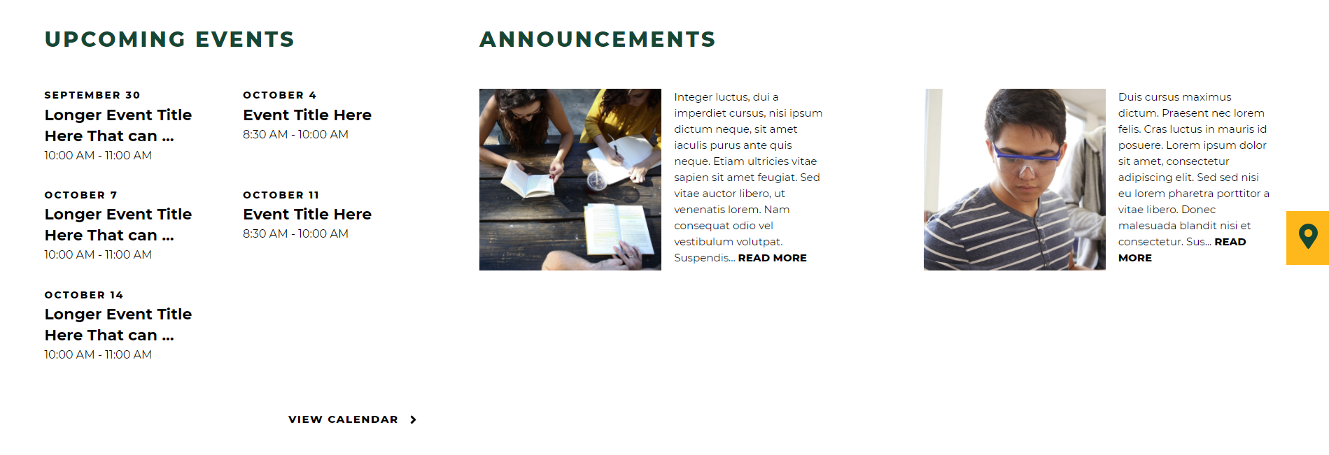
Upcoming Events
Upcoming events include a client editable section title and an editable hyperlink. Calendar events can be filtered from specific calendar categories. Calendar events from the FACTS SIS and Google Calendar can be integrated into School Site, in addition to the School Site Calendar Database.
Announcements
The Announcement section includes a client editable section title. Announcements can be fed from FACTS SIS or the School Site Announcements Database. The image and hyperlink are optional. Text will be truncated after 250 characters & spaces.